Larymar/Material.Avaloniav3.13.1
.NET 8.0.NET Std2.0
This repository is a set of styles that will help you customize your application in an appropriate material design.
Get Started
$ dotnet add package Material.AvaloniaReadme
 Material.Avalonia
Customizable Material Design implementation for AvaloniaUI framework.
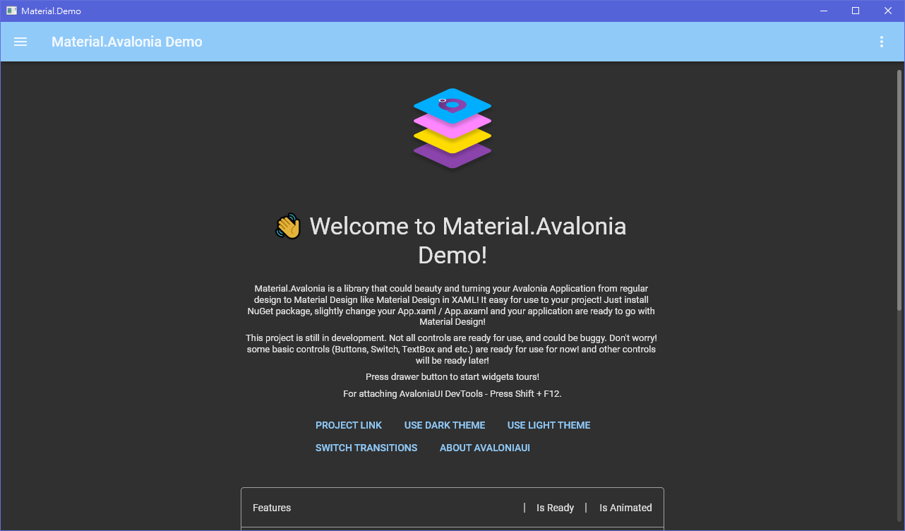
- More screenshots
- Live demo in your browser
Currently, in the alpha stage, many things can be broken.
Overview
This library is a collection of styles and controls to help you customize your Avalonia application with Material Design theme.
- Material Design styles for almost all Avalonia controls
- Additional controls to support the Snackbars, side sheets, floating buttons, cards, dialogs and more
- Easy configuration of palette (at design and runtime), according to Material Guidelines guidelines
- Full Material Design Icons icon pack support (must be installed separately, in favor of small library size)
- Demo applications included in the source project


Getting started
Check out the getting started wiki page. Or follow these instructions:
-
Add Material.Avalonia nuget package to your project:


