Essential helpers for developing WinUI(UWP)
Get Started
$ dotnet add package WinUIEssential.UWPReadme

WinUI Essentials
A repo dedicated for simplifying C++ development with WinUI2 (Universal Windows Platform) and WinUI3 (Windows App SDK).


Example project build status:
Usage
[!WARNING] Make sure to set your C++ language version to C++20 first!
Open the WinUIEssential.sln containing 4 projects:
- UWPPackage (project for WinUIEssential.UWP nuget package)
- UWPExample (example gallery for using the above package)
- WinUI3Package (project for WinUIEssential.WinUI3 nuget package)
- WinUI3Example (example gallery for using the above package)
Build the *Package project will build the project and pack it with nuget, then install the nuget to your project and start using it.
To build the *Example project, do the same thing. They did not reference *Package for demo purposes.
[!NOTE] Functionalities for UWP and WinUI3 should be exactly the same unless otherwise noted!
It should be useful until the community toolkit provides C++.
Content
| Component | UWP | WinUI3 | Type |
|---|---|---|---|
| WinUIIncludes | :white_check_mark: | :x: | Header only |
| TemplateControlHelper | :white_check_mark: | :white_check_mark: | Header only |
| Glyphs | :white_check_mark: | :white_check_mark: | Header only + Xaml only |
| BadgeGlyphs | :white_check_mark: | :white_check_mark: | Header only |
| ToastTemplates | :white_check_mark: | :white_check_mark: | Header only |
| ToastBuilder | :white_check_mark: | :white_check_mark: | Header only |
| TileTemplates | :white_check_mark: | :white_check_mark: | Header only |
| TileBuilder | :white_check_mark: | :white_check_mark: | Header only |
| CursorController | :white_check_mark: | :white_check_mark: | WinRT component |
| PropertyChangeHelper | :white_check_mark: | :white_check_mark: | Header only |
| NegateBoolConverter | :white_check_mark: | :white_check_mark: | WinRT component |
| BoolToVisibilityConverter | :white_check_mark: | :white_check_mark: | WinRT component |
| ContainerToBoolConverter | :white_check_mark: | :white_check_mark: | WinRT component |
| StringToBoolConverter | :white_check_mark: | :white_check_mark: | WinRT component |
| ReferenceToBoolConverter | :white_check_mark: | :white_check_mark: | WinRT component |
| ConverterGroup | :white_check_mark: | :white_check_mark: | WinRT component |
| IsEqualStringTrigger | :white_check_mark: | :white_check_mark: | WinRT component |
| IsNullOrEmptyStateTrigger | :white_check_mark: | :white_check_mark: | WinRT component |
| ControlSizeTrigger | :white_check_mark: | :white_check_mark: | WinRT component |
| CharmBar | :white_check_mark: | :x: | WinRT component |
| GroupBox | :white_check_mark: | :white_check_mark: | Control |
| SettingsCard | :white_check_mark: | :white_check_mark:* | Control |
| SettingsExpander | :white_check_mark: | :white_check_mark:* | Control |
| IconButton | :white_check_mark: | :white_check_mark: | Control |
| FontIconExtension | :white_check_mark: | :white_check_mark: | WinRT component |
| DependentValue | :white_check_mark: | :white_check_mark: | WinRT component |
| Taskbar | :x: | :white_check_mark: | Header only |
| MarqueeText | :white_check_mark: | :white_check_mark: | Control |
| ProgressBarEx | :white_check_mark: | :white_check_mark: | Control |
| WindowEx | :x: | :white_check_mark: | Window |
| TransparentBackdrop | :x: | :white_check_mark: | SystemBackdrop |
| Segmented | :white_check_mark: | :white_check_mark: | Control |
| CustomMicaBackdrop | :x: | :white_check_mark: | Backdrop |
| CustomAcrylicBackdrop | :x: | :white_check_mark: | Backdrop |
| Shimmer | :white_check_mark: | :white_check_mark: | Control |
| ImageExtension | :white_check_mark: | :white_check_mark: | WinRT component |
*means additional settings required, see the sections for info
WinUIIncludes
Include the WinUI2 headers in your pch.h, so you don't waste your time figuring out where the compilation error comming from./
Usage:
Add this in your pch.h
#include <WinUIIncludes.hpp>
TemplateControlHelper
Automatically call DefaultStyleKey() for your templated control so you don't waste your time when you forget to include this line and get an empty control.
Usage: Inherit this class in your header file, make the template argument your implementation type.
#include <TemplateControlHelper.hpp>
...
struct MyControl : MyControlT<MyControl>, TemplateControlHelper<MyControl>
{
    ...
};
ToastHelper
Helper for creating toast notifications.
ToastTemplates --- namespace ToastTemplates
The built-in templates re-written to strongly-typed classes that derived from winrt::Windows::UI::Notification::ToastNotification, so that you can directly use them as arguments forwinrt::Windows::UI::Notifications::ToastNotificationManager. Example usage:
#include <ToastTemplates.hpp>
winrt::Windows::UI::Notifications::ToastNotificationManager::CreateToastNotifier()
    .Show(ToastTemplates::ImageWithHeaderAndBody{ L"ms-appx:///Assets/Windows 11.png", L"Header", L"body" });
//alternatively use Microsoft's template name
winrt::Windows::UI::Notifications::ToastNotificationManager::CreateToastNotifier()
    .Show(ToastTemplates::ToastImageAndText02{ L"ms-appx:///Assets/Windows 11.png", L"Header", L"body" });
| Type | Template Name(which can also be used as type) | Sample |
|---|---|---|
BodyTextOnly | ToastText01 | 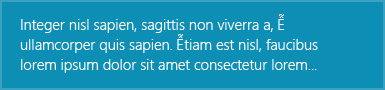 |
SingleLineHeaderWithBody | ToastText02 | 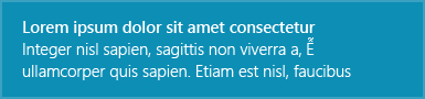 |
TwoLineHeaderWithBody | ToastText03 | 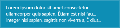 |
HeaderWithTwoSingleLineBody | ToastText04 | 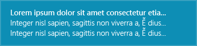 |
ImageWithBodyOnly | ToastImageAndText01 |  |
ImageWithHeaderAndBody | ToastImageAndText02 |  |
ImageWithTwoLineHeaderAndBody | ToastImageAndText03 |  |
ImageWithHeaderAndTwoSingleLineBody | ToastImageAndText04 | 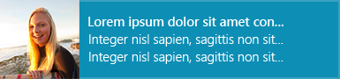 |
ToastBuilder --- namespace ToastBuilder
Strongly-typed, declarative toast notification elements to quickly build toast notifications, as if you are writing XAML. Schema here. Example usage:
| XML | C++ |
<toast duration="long" scenario="reminder" useButtonStyle="true">
    <visual>
        <binding template="ToastText04">
            <text id="1">headline</text>
            <text id="2">body text1</text>
            <text id="3">body text2</text>
        </binding>
    </visual>
    <actions>
        <action content="Accept" arguments="accept"/>
    </actions>
</toast>
|
Toast().Duration(Long).Scenario(Reminder).UseButtonStyle(true)
(
    Visual()
    (
        Binding().Template(L"ToastText04")
        (
            Text().Id(1)(L"headline"),
            Text().Id(2)(L"body text1"),
            Text().Id(3)(L"body text2")
        )
    ),
    Actions()
    (
        Action().Content(L"Accept").Arguments(L"accept")
    )
)
|
|
|
|
|
|
|
Optionally add a handler to Action so you can handle toast notification button click right on site. For more info, see the comment documentation.
Actions()
(
	Action().Content(L"Accept").Arguments(L"accept")
	.Click([this](winrt::Windows::ApplicationModel::Activation::ToastNotificationActivatedEventArgs args)
	{
        //Handle Accept button
	}),
	Action().Content(L"Cancel").Arguments(L"cancel")
	.Click([this](winrt::Windows::ApplicationModel::Activation::ToastNotificationActivatedEventArgs args)
	{
        //Handle Cancel button
	})
)
TileTemplates --- namespace TileTemplates
Similar to ToastTemplates, but for strongly-typed tile templates.
TileBuilder --- namespace TileBuilder
Similar to ToastBuilder, but for building tiles.
Glphys --- namespace Glyphs
Font glyphs value for Segoe MDL2 Assets fonts. Usage:
#include <Glyphs.hpp>
FontIcon().Glyph(Glyphs::GlobalNavButton);
There is also a Glyph xaml resource dictionary, so you can use name instead of glyph. Usage:
- Add this to your
App.xaml(UWP)
<Application.Resources>
    <controls:XamlControlsResources>
        <controls:XamlControlsResources.MergedDictionaries>
            <ResourceDictionary Source="ms-appx:///UWPPackage/Glyphs.xaml"/>
            ...
        </controls:XamlControlsResources.MergedDictionaries>
    </controls:XamlControlsResources>
</Application.Resources>
Add this to your App.xaml (WinUI3)
<Application.Resources>
    <ResourceDictionary>
        <ResourceDictionary.MergedDictionaries>
            <ResourceDictionary Source="ms-appx:///WinUI3Package/Glyphs.xaml"/>
            ...
        </ResourceDictionary.MergedDictionaries>
    </ResourceDictionary>
</Application.Resources>
- Then use
StaticResourcewith name to reference the glyph
<FontIcon Glyph="{StaticResource Send}"/>
CursorController --- namespace CursorController
Xaml helper for controlling the cursor type when mouse enters.
Value for Type is CoreCursorType enum. Usage:
xmlns:essential="using:WinUI3Package"
...
<Rectangle Fill="Red" essential:CursorController.Type="Hand"/>
PropertyChangeHelper --- namespace MvvmHelper
Helper for OneWay binding.
Usage:
- Inherit
Windows.UI.Xaml.Data.INotifyPropertyChangedinidl
[default_interface]
runtimeclass MyPage : Windows.UI.Xaml.Controls.Page, Windows.UI.Xaml.Data.INotifyPropertyChanged
{
    ...
};
- Inherit from this class in the implementation class.
/*MyPage.xaml.h*/
#include <include/PropertyChangeHelper.hpp>

namespace winrt::<MyProject>::implementation
{
    struct MyPage : MyMusicT<MyMusic>, MvvmHelper::PropertyChangeHelper<MyMusic>
    {
        int m_value;
        void Value(int newValue)
        {
            compareAndRaise(m_value, newValue, L"Value");
        };
    }
}
Converters
- bool -> Visibility namespace
BoolToVisibilityConverter - bool negation namespace
NegateBoolConverter - container (IVector, IMap) -> bool namespace
ContainerToBoolConverter - reference (any WinRT runtime type) -> bool namespace
ReferenceToBoolConverter - String -> bool namespace
StringToBoolConverter - ConverterGroups namespace
ConverterGroups:- define series of converters, that convert value from converter1 -> converter2 -> ...
- usage:
 <essential:ConverterGroup x:Key="StringToVisibilityConverter">
     <essential:StringToBoolConverter/>
     <essential:BoolToVisibilityConverter/>
 </essential:ConverterGroup>
BadgeGlyphs --- namespace BadgeGlyphs
Helpers for creating badge notification xml. Usage:
#include <include/BadgeGlyphs.hpp>

//glyph badge
winrt::Windows::UI::Notifications::BadgeUpdateManager::CreateBadgeUpdaterForApplication()
	.Update(BadgeGlyphs::MakeBadgeNotification(BadgeGlyphs::Alert));

//number badge
winrt::Windows::UI::Notifications::BadgeUpdateManager::CreateBadgeUpdaterForApplication()
	.Update(BadgeGlyphs::MakeBadgeNotification(1));
Triggers
See the same class in Community Toolkit for documentation.
ControlSizeTrigger --- namespace ControlSizeTrigger
IsEqualStringTrigger --- namespace IsEqualStringTrigger
Note: For the reason of lacking reflection, we cannot implement `IsEqualStateTrigger
IsNullOrEmptyStateTrigger --- namespace IsNullOrEmptyStateTrigger
SettingsCard --- namespace SettingsCard
See the same class in Community Tookit for documentation.
- Add this to
App.xaml(UWP)
<Application.Resources>
    <controls:XamlControlsResources>
        <controls:XamlControlsResources.MergedDictionaries>
            <ResourceDictionary Source="ms-appx:///UWPPackage/SettingsCard_Resource.xaml"/>
            ...
        </controls:XamlControlsResources.MergedDictionaries>
    </controls:XamlControlsResources>
</Application.Resources>
- Add this to
App.xaml(WinUI3)
<Application.Resources>
    <ResourceDictionary>
        <ResourceDictionary.MergedDictionaries>
            <ResourceDictionary Source="ms-appx:///WinUI3Package/SettingsCard_Resource.xaml"/>
            ...
        </ResourceDictionary.MergedDictionaries>
    </ResourceDictionary>
</Application.Resources>
[!NOTE] For WinUI3, add
#include #include <winrt/Microsoft.UI.Xaml.Controls.AnimatedVisuals.h>to yourpch.h
SettingsExpander --- namespace SettingsExpander
See the same class in Community Tookit for documentation.
 Add this to
 App.xaml (UWP)
<Application.Resources>
    <controls:XamlControlsResources>
        <controls:XamlControlsResources.MergedDictionaries>
            <ResourceDictionary Source="ms-appx:///UWPPackage/SettingsCard_Resource.xaml"/>
            <ResourceDictionary Source="ms-appx:///UWPPackage/SettingsExpander_Resource.xaml"/>
            ...
        </controls:XamlControlsResources.MergedDictionaries>
    </controls:XamlControlsResources>
</Application.Resources>
Add this to App.xaml (WinUI3)
<Application.Resources>
    <ResourceDictionary>
        <ResourceDictionary.MergedDictionaries>
            <ResourceDictionary Source="ms-appx:///WinUI3Package/SettingsCard_Resource.xaml"/>
            <ResourceDictionary Source="ms-appx:///WinUI3Package/SettingsExpander_Resource.xaml"/>
            ...
        </ResourceDictionary.MergedDictionaries>
    </ResourceDictionary>
</Application.Resources>
[!NOTE] For WinUI3, add
#include #include <winrt/Microsoft.UI.Xaml.Controls.AnimatedVisuals.h>to yourpch.h
CharmBar
Installing this nuget will automatically add
then add a Desktop Extension to your UWP project <WinUIEssentialAddDesktopExtension>true</WinUIEssentialAddDesktopExtension> under PropertyGroup node in your vcxproj file
so you can use the good-ol Windows 8 style charm bar. This package further simplifies it's usage by allowing you to directly define local and global settings, directly in XAML containing UI element.
- Define a global setting in resource section, with
SettingsPaneEx.Settings
<Application.Resources>
    <ResourceDictionary>
        <essential:SettingsPaneEx.Settings>
            <!--SettingsCommandEx items-->
            <essential:SettingsCommandEx Id="Item1" Label="Item123">
                <StackPanel>
                    <TextBlock Text="Text1 in item1"/>
                    <TextBlock Text="Text2 in item1"/>
                </StackPanel>
            </essential:SettingsCommandEx>=
            <essential:SettingsCommandEx Id="Item2" Label="Item456">
                <StackPanel>
                    <TextBlock Text="Text3 in item2"/>
                    <TextBlock Text="Text4 in item2"/>
                </StackPanel>
            </essential:SettingsCommandEx>
        </essential:SettingsPaneEx.Settings>
    </ResourceDictionary>
</Application.Resources>

- Define local settings, where you put instance of
SettingsPaneExdirectly in UI as any other xaml controls.
<Page
    ...
>
    <StackPanel Orientation="Horizontal" HorizontalAlignment="Center" VerticalAlignment="Center">
        <essential:SettingsPaneEx x:Name="LocalSettings">
            <!--SettingsCommandEx items-->
            ...
        </essential:SettingsPaneEx>
    </StackPanel>
</Page>

Define keyboard shortcuts with SettingsPaneEx.KeyboardAccelerator property.
<essential:SettingsPaneEx.KeyboardAccelerator>
    <KeyboardAccelerator Modifiers="Control" Key="s"/> <!-- Ctrl+S to open settings -->
</essential:SettingsPaneEx.KeyboardAccelerator>
DependentValue ---namespace DependentValue
A wrapper around a double which you can target to with a Storyboard and DoubleAnimation, and get value out of it. Value is accessed by .Value property, which is a DependencyProperty, so you can do a OneWay binding to it or listen for value change notification.
[!NOTE] Remember to set
EnableDependentAnimation="True"to make it work!
Usage:
<Page.Resources>
    <essential:DependentValue x:Name="MyDoubleValue"/>
    <Storyboard x:Name="DoubleValueAnimation">
        <DoubleAnimation
            From="0"
            To="100"
            Storyboard.TargetName="MyDoubleValue"
            Storyboard.TargetProperty="Value"
            EnableDependentAnimation="True"/>
    </Storyboard>
</Page.Resources>

<StackPanel Orientation="Horizontal" HorizontalAlignment="Center" VerticalAlignment="Center">
    <Button Click="ClickHandler">Click to start storyboard</Button>
    <TextBlock Text="{x:Bind MyDoubleValue.Value, Mode=OneWay}"/>
</StackPanel>
Taskbar --- namespace Taskbar
Helper for setting taskbar status and progress. Usage:
//Set taskbar status
Taskbar::SetProgressState(hwnd, Taskbar::ProgressState::Normal);
//Set taskbar progress value
Taskbar::SetProgressValue(hwnd, 50); //a third optional parameter for total, default -> 100
MarqueeText --- namespace MarqueeText
Enhanced version of MarqueeText in the community toolkit.

IconButton --- namespace IconButton
Expandable button, which shows an icon (actually anything) in its default state, and a content when you hover on it.
- Add this to
App.xaml(UWP)
<Application.Resources>
    <controls:XamlControlsResources>
        <controls:XamlControlsResources.MergedDictionaries>
            <ResourceDictionary Source="ms-appx:///UWPPackage/IconButton_Resource.xaml"/>
            ...
        </controls:XamlControlsResources.MergedDictionaries>
    </controls:XamlControlsResources>
</Application.Resources>
- Add this to
App.xaml(WinUI3)
<Application.Resources>
    <ResourceDictionary>
        <ResourceDictionary.MergedDictionaries>
            <ResourceDictionary Source="ms-appx:///WinUI3Package/IconButton_Resource.xaml"/>
            ...
        </ResourceDictionary.MergedDictionaries>
    </ResourceDictionary>
</Application.Resources>
ProgressBarEx --- namespace ProgressBarEx
A progress bar with animated highlight colors (and animated progress). Default to vista-like styles but also allows you to customize its color.
| Property | DependencyProperty? | Description |
|---|---|---|
| HighColor | :white_check_mark: | the shimmer highlight color |
| BaseColor | :white_check_mark: | the base background color of the finish part |
| Background | :white_check_mark: | the color of the rest part |
| Percent | :white_check_mark: | range: 0~100 |
| Value | :white_check_mark: | normalized percent, range: 0.0~1.0 |
 Add this to
 App.xaml (UWP)
<Application.Resources>
    <controls:XamlControlsResources>
        <controls:XamlControlsResources.MergedDictionaries>
            <ResourceDictionary Source="ms-appx:///Glyphs.xaml"/>
            ...
        </controls:XamlControlsResources.MergedDictionaries>
    </controls:XamlControlsResources>
</Application.Resources>
Add this to App.xaml (WinUI3)
<Application.Resources>
    <ResourceDictionary>
        <ResourceDictionary.MergedDictionaries>
            <ResourceDictionary Source="ms-appx:///WinUI3Package/ProgressBarEx_Resource.xaml"/>
            ...
        </ResourceDictionary.MergedDictionaries>
    </ResourceDictionary>
</Application.Resources>
WindowEx --- namespace WindowEx
Basic Property
| name | Description |
|---|---|
| Int32 MinWidth; | Minimum width in DIP |
| Int32 MaxWidth; | Maximum width in DIP |
| Int32 MinHeight; | ... |
| Int32 MaxHeight; | ... |
| Int32 Width; | ... |
| Int32 Height; | ... |
| Int32 RawWidth; | Actual width in pixel |
| Int32 RawHeight; | Actual height in pixel |
| UInt32 Dpi{ get; }; | Current window dpi |
| Boolean IsMinimizable; | ... |
| Boolean IsMaximizable; | ... |
| Boolean HasBorder; | ... |
| Boolean HasTitleBar; | ... |
| Boolean IsResizable; | ... |
| Boolean IsAlwaysOnTop; | ... |
| Boolean IsShownInSwitcher; | ... |
| Boolean TitleBarDarkMode; | Set win32 titlebar to dark mode (support down to Windows 10 17763) |
| Boolean TitleBarAutoDarkMode; | Enable automatic titlebar dark mode (support down to Windows 10 17763), works regardless of ExtendContentIntoTitleBar |
| Microsoft.UI.Xaml.UIElement TitleBar; | Custom title bar, if set, automatically calls ExtendContentIntoTitleBar for you |
| String Icon; | Set .ico icon used for win32 titlebar |
Extensions
WindowEx.IsInteractive: used when customizing a title bar, automatically calculate and update InputNonClientPointerSource for you
Usage:
<essential:WindowEx.TitleBar>
    <Grid x:Name="AppTitleBar" Height="48" Loaded="AppTitleBar_Loaded">
        <Grid.ColumnDefinitions>
            ...
        </Grid.ColumnDefinitions>

        <AutoSuggestBox x:Name="TitleBarSearchBox"
                Grid.Column="4"
                QueryIcon="Find"
                PlaceholderText="Search"
                VerticalAlignment="Center"
                MaxWidth="600"
                essential:WindowEx.IsInteractive="True"/>
        <PersonPicture x:Name="PersonPic"
               Grid.Column="6"
               Height="32" Margin="0,0,16,0"
               essential:WindowEx.IsInteractive="True"/>
    </Grid>
</essential:WindowEx.TitleBar>
TransparentBackdrop --- namespace `TransparentBackdrop
Make your WindowEx fully transparent.
<essential:WindowEx
    ...
    <essential:WindowEx.SystemBackdrop>
        <essential:TransparentBackdrop/>
    <essential:WindowEx.SystemBackdrop>
</essential:WindowEx>
- left: ExtendContentIntoTitleBar
- right: Win32 Titlebar
UIElementExtension --- namespace UIElementExtension
See the same class in Community Toolkit for documentation. Usage:
<Grid Width="148"
    Height="148"
    essential:UIElementExtension.ClipToBounds="True"
    .../>
Segmented --- namespace Segmented
Almost like the Segmented control in Community Toolkit but with more customizations.
- Animated selected-item transition

- Does not limited to
Icon + Text. Use any UIElement
<essential:SegmentedItem>
<StackPanel Orientation="Horizontal">
<FontIcon Glyph=""/>
<TextBlock Text="Week"/>
</StackPanel>
</essential:SegmentedItem>
- Button style has 0 size margin
<essential:Segmented Style="{StaticResource ButtonSegmentedStyle}">
<essential:SegmentedItem>
<StackPanel Orientation="Horizontal" Spacing="4">
<FontIcon Glyph=""/>
<TextBlock Text="Day"/>
</StackPanel>
</essential:SegmentedItem>
<essential:SegmentedItem>
<StackPanel Orientation="Horizontal" Spacing="4">
<FontIcon Glyph=""/>
<TextBlock Text="Week"/>
</StackPanel>
</essential:SegmentedItem>
<essential:SegmentedItem>
<StackPanel Orientation="Horizontal" Spacing="4}">
<FontIcon Glyph=""/>
<TextBlock Text="Month"/>
</StackPanel>
</essential:SegmentedItem>
</essential:Segmented>

- Support vertical layout
<essential:Segmented>
    <essential:SegmentedItem>
        <StackPanel Orientation="Horizontal" Spacing="7">
            <SymbolIcon Symbol="Accept"/>
            <TextBlock Text="Content1"/>
        </StackPanel>
    </essential:SegmentedItem>

    <essential:SegmentedItem>
        <StackPanel Orientation="Horizontal" Spacing="7">
            <SymbolIcon Symbol="Add"/>
            <TextBlock Text="Content2"/>
        </StackPanel>
    </essential:SegmentedItem>

    <essential:SegmentedItem>
        <StackPanel Orientation="Horizontal" Spacing="7">
            <SymbolIcon Symbol="Admin"/>
            <StackPanel Orientation="Vertical">
                <TextBlock Text="Content longerrrrrrrrrr"/>
                <TextBlock Text="Content 2nd line"/>
            </StackPanel>
        </StackPanel>
    </essential:SegmentedItem>

    <essential:Segmented.ItemsPanel>
        <ItemsPanelTemplate>
            <StackPanel Orientation="Vertical"/>
        </ItemsPanelTemplate>
    </essential:Segmented.ItemsPanel>
</essential:Segmented>
- Allow reordering items
<essential:Segmented CanReorderItems="True" AllowDrop="True"
    ...
Usage:
- Add this to
App.xaml(UWP)
<Application.Resources>
    <controls:XamlControlsResources>
        <controls:XamlControlsResources.MergedDictionaries>
            <ResourceDictionary Source="ms-appx:///UWPPackage/Segmented_Resource.xaml"/>
            ...
        </controls:XamlControlsResources.MergedDictionaries>
    </controls:XamlControlsResources>
</Application.Resources>
- Add this to
App.xaml(WinUI3)
<Application.Resources>
    <ResourceDictionary>
        <ResourceDictionary.MergedDictionaries>
            <ResourceDictionary Source="ms-appx:///WinUI3Package/Segmented_Resource.xaml"/>
            ...
        </ResourceDictionary.MergedDictionaries>
    </ResourceDictionary>
</Application.Resources>
CustomAcrylicBackdrop
A customizable acrylic backdrop with bindable properties, and can be set as active when the window is inactive.
| Property | Type | DependencyProperty? |
|---|---|---|
| FallbackColor | Color | :white_check_mark: |
| TintColor | Color | :white_check_mark: |
| Kind | DesktopAcrylicKind | :white_check_mark: |
| LuminosityOpacity | Single | :white_check_mark: |
| TintOpacity | Single | :white_check_mark: |
| EnableWhenInactive | Boolean | :white_check_mark: |
CustomMicaBackdrop
 A customizable mica backdrop with bindable properties, and can be set as active when the window is inactive.
| Property | Type | DependencyProperty? |
|---|---|---|
| FallbackColor | Color | :white_check_mark: |
| TintColor | Color | :white_check_mark: |
| Kind | MicaKind | :white_check_mark: |
| LuminosityOpacity | Single | :white_check_mark: |
| TintOpacity | Single | :white_check_mark: |
| EnableWhenInactive | Boolean | :white_check_mark: |
Shimmer
Similar to the Shimmer in Community Toolkit, but it's a ContentControl, which allows you to directly put content into it, making it easier to use.
Also, the ShimmerGradientStops is a resource of type Windows.UI.Xaml.Media.GradientStopCollection which allows to be override.
| Property | Type | DependencyProperty? |
|---|---|---|
| IsLoading | Boolean | :white_check_mark: |
ImageExtension
Automatically display a fallback image when Image failed to load.
Usage:
<Image
    essential:ImageExtension.FallbackSource="ms-appx:///Assets/Owl.jpg"
    Source="https://upload.wikimedia.org/wikipedia/commons/5/5f/Windows_logo_-_2012.svg" />