This package provides the functionality to utilize the features of Syncfusion® Blazor AutoComplete, ComboBox, DropDownList, ListBox, and MultiSelect Dropdown.
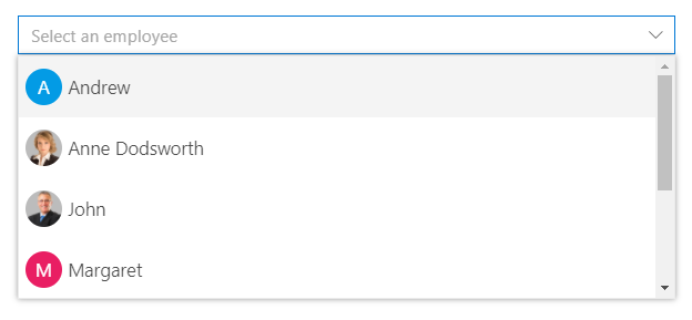
The Blazor DropDownList is a quick replacement of the HTML select tags. It has a rich appearance and allows users to select a single value that is non-editable from a list of predefined values. It has several out-of-the-box features, such as data binding, filtering, grouping, UI customization, accessibility, and preselected values.
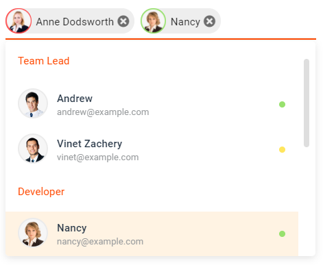
The Blazor MultiSelect Dropdown is a quick replacement for the HTML select tag for selecting multiple values. HTML MultiSelect Dropdown is a textbox component that allows the user to type or select multiple values from a list of predefined options. It has several out-of-the-box features such as data binding, filtering, grouping, tagging with custom values, and checkbox mode.
The Blazor ListBox is a graphical user interface for displaying a list of items with multi-selection options. It has a rich appearance and allows users to select one or more items from the list using checkboxes or keyboard interactions. It has several out-of-the-box features, such as data binding, sorting, grouping, reordering, dragging and dropping, UI customization, and accessibility.
The Blazor ComboBox component is a drop-down list with an editable option that also allows users to choose an option from a predefined pop-up list. It can be used as an alternative to the HTML select tag and has several out-of-the-box features such as data binding, filtering, grouping, cascading, templates, UI customization, pop-up list customization, and more.
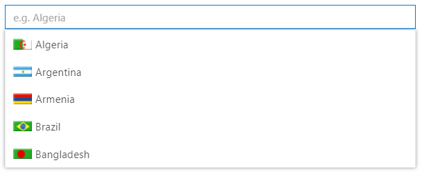
The Blazor AutoComplete or typeahead is a textbox component that provides a list of suggestions to select from as the user types. It has several out-of-the-box features such as data binding, filtering, grouping, UI customization, accessibility, and more.
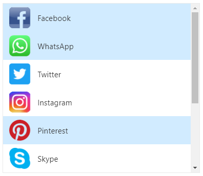
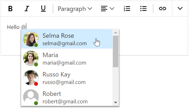
The Mention component displays a list of suggested items from which users can select or tag one. To tag an item, enter the Mention character in the editable element and choose from the suggestion list, similar to popular social media sites like Facebook, Twitter, and more. This component supports various out-of-the-box features, including data binding, grouping, UI customization, accessibility, and more.
This is a commercial product and requires a paid license for possession or use. Syncfusion® licensed software, including this component, is subject to the terms and conditions of Syncfusion® EULA. You can purchase a license here or start a free 30-day trial here.
About Syncfusion®
Founded in 2001 and headquartered in Research Triangle Park, N.C., Syncfusion® has more than 29,000 customers and more than 1 million users, including large financial institutions, Fortune 500 companies, and global IT consultancies.