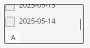
Uno Platform compatible UI Controls Collection scroller. For example it can be used as a CheckBoxCombo control.
Get Started
$ dotnet add package GridScroller.PackageReadme
GridScroller
Uno Platform compatible UI Controls Collection scroller. For example it can be used as a CheckBoxCombo control.
License Overview
This project is dual-licensed under the following terms:
-
Non-Commercial Use
- Licensed under the Apache-2.0.
- Users must share the modifications they have made.
- This applies only to non-commercial users.
-
Commercial Use
- Requires a separate commercial license. A Licensee Number will need to be purchased.
- Commercial users do not have to share modifications.
- Contact Email: rauf.hammad@outlook.com or Website:https://hexword.ca for licensing inquiries.
Getting Started
- Non-commercial users can use the Apache-2.0 license.
- Commercial users must obtain a commercial licensee number before use.
For full terms, see LICENSE-Apache-2.0 and LICENSE-commercial.
Installing from Nuget.org
This software is available on NuGet.org as the GridScroller.Package.
To install the GridScroller package, you can use the NuGet Package Manager Console, the NuGet Package Manager in Visual Studio, or dotnet cli commands.
Using NuGet Package Manager Console
NuGet\Install-Package GridScroller.Package
Using dotNet CLI
dotnet add package GridScroller.Package
Example Usage
In your XAML file, add the namespace for the GridScroller control. Then use <gs:cmpGridScroller /> tag to define the control. You can add UI items inside the gs:cmpGridScroller.Items tag.
<Page x:Class="zevBrowserXaml.MainPage"
      xmlns="http://schemas.microsoft.com/winfx/2006/xaml/presentation"
      xmlns:x="http://schemas.microsoft.com/winfx/2006/xaml"
      xmlns:local="using:zevBrowserXaml"
      xmlns:muxc="using:Microsoft.UI.Xaml.Controls"
      xmlns:gs="using:GridScroller.Package"
      Background="{ThemeResource ApplicationPageBackgroundThemeBrush}">
    <Grid>
            <!-- Define flexible rows and columns -->
            <Grid.RowDefinitions>
                <RowDefinition Height="Auto" />
                <RowDefinition Height="Auto" />
                <RowDefinition Height="Auto" />
                <RowDefinition Height="Auto" />
                <RowDefinition Height="Auto" />
                <RowDefinition Height="Auto" />
                <RowDefinition Height="Auto" />
                <RowDefinition Height="*" />
            </Grid.RowDefinitions>
            <Grid.ColumnDefinitions>
                <ColumnDefinition Width="Auto" />
                <ColumnDefinition Width="Auto" />
                <ColumnDefinition Width="Auto" />
                <ColumnDefinition Width="Auto" />
                <ColumnDefinition Width="*" />
            </Grid.ColumnDefinitions>

            <!-- Define the GridScroller UI Control -->
            <gs:cmpGridScroller Width="180" Height="100"
                    Background="LightYellow"
                    BorderBrush="Black"
                    BorderThickness="1" CornerRadius="5"
                    Margin="10" Grid.Row="2" Grid.RowSpan="3"
                    Grid.Column="1" Grid.ColumnSpan="2">
                <gs:cmpGridScroller.Items>
                    <CheckBox Content="Date Folder 1" Margin="5" />
                    <CheckBox Content="Date Folder 2" Margin="5" />
                    <CheckBox Content="Date Folder 3" Margin="5" />
                    <CheckBox Content="Date Folder 4" Margin="5" />
                    <CheckBox Content="Date Folder 5" Margin="5" />
                    <CheckBox Content="Date Folder 6" Margin="5" />
                </gs:cmpGridScroller.Items>
            </gs:cmpGridScroller>
    </Grid>
    </Page>
In your code-behind file, you can access the GridScroller.Package control and its items. For example:
public sealed partial class MainPage : Page
{
    public MainPage()
    {
        this.InitializeComponent();
        // Initialize the GridScroller control programatically
        this.gsDates.Items = new ObservableCollection<UIElement>
        {
            new CheckBox { Content = "2025-05-12" },
            new CheckBox { Content = "2025-05-13" },
            new CheckBox { Content = "2025-05-14" },
            new Button { Content = "A" },
            new Button { Content = "B" }
        };
        this.gsDates.Background = new SolidColorBrush(Microsoft.UI.Colors.White);
    }
}
Images
Animated View - GridScroller
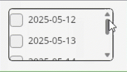
Screen Capture - GridScroller