welisson.me/ControlDays.Calendar.Mauiv1.0.1
.NET 7.0.NET 7.0-android33.0.NET 7.0-ios16.1.NET 7.0-maccatalyst16.1
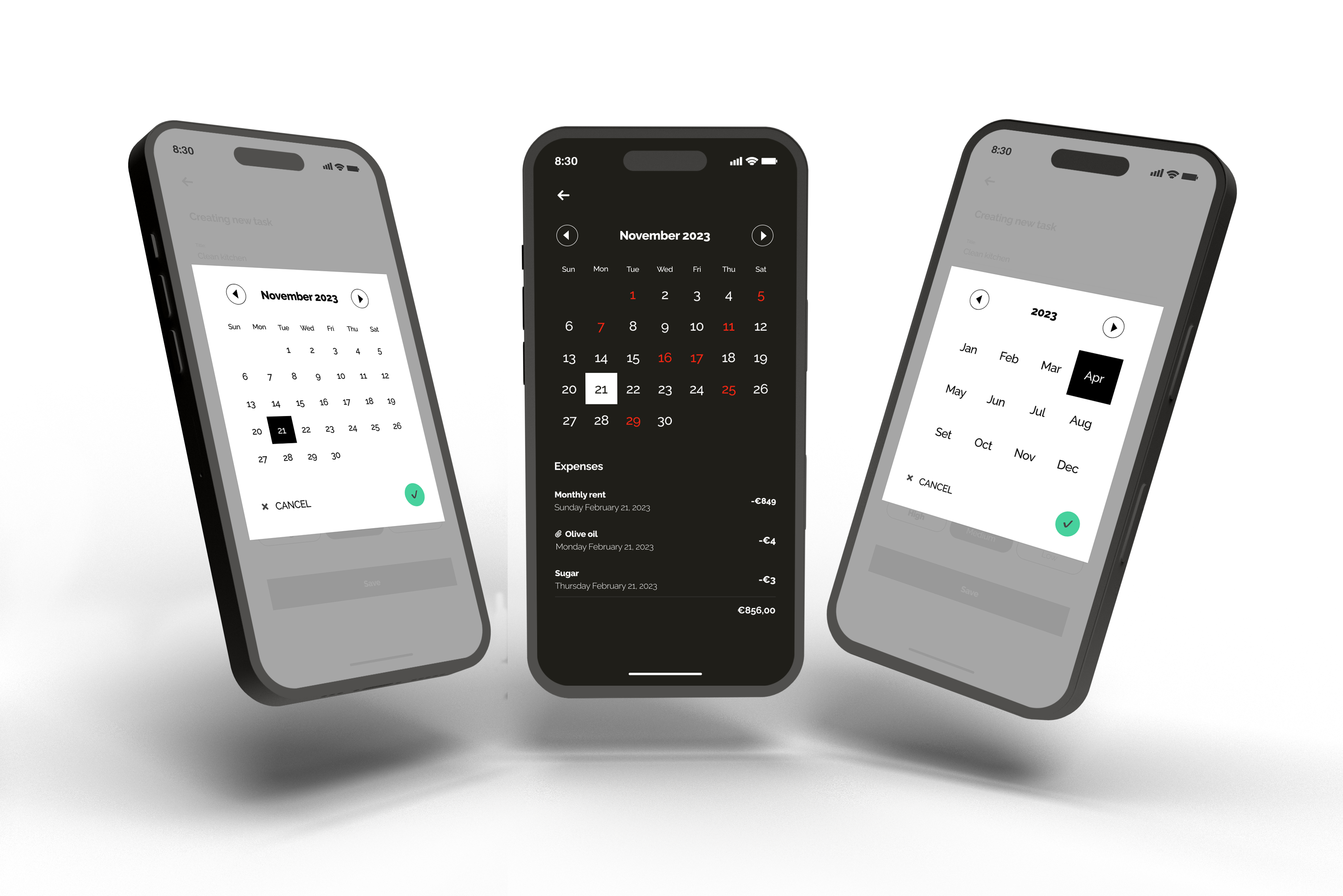
MauiDays is a .NET MAUI library that provides a customizable month and day calendar popup selector, along with a calendar page. It allows developers to easily add date selection functionality to their .NET MAUI apps.
Get Started
$ dotnet add package ControlDays.Calendar.MauiReadme
MAUIDays NuGet Package for Month and Day Calendar in .NET MAUI
MauiDays is a .NET MAUI library that provides a customizable month and day calendar popup selector, along with a calendar page. It allows developers to easily add date selection functionality to their .NET MAUI apps.
The library has a dependency on Mopups, which is used for the month and day calendar popup selector functionality. Note that if you only need the calendar page, you do not need to install Mopups.
Compatibility
| Platform | Version | Popups Availability | Calendar Page Availability |
|---|---|---|---|
| iOS | 14.0 and higher | ✅ | ✅ |
| Android | 5.0 and higher | ✅ | ✅ |
| Windows | 10.0.17763.0 and higher | ❌ | ✅ |
| macOS | 10.15 and higher | ✅ | ✅ |
Features
- Single Day Selector popup: your users can easily select a specific day of the month to view or schedule events.
- Single Month Selector popup: similarly, the Month Selector popup allows users to quickly select a specific month and year to view or schedule events.
- Calendar Page: displays a day calendar along with a customizable view below it.
Getting Started
Installation
To use this package, simply install it in your .NET MAUI project using NuGet. In Visual Studio, you can do this by right-clicking on your project and selecting "Manage NuGet Packages". From there, search for "ControlDays.Calendar.Maui" and install the latest version.
dotnet add package ControlDays.Calendar.Maui
Usage
Popups
Please, remember that you need to install and configure the Mopups nuget package. This dependency is necessary to use the popups.
dotnet add package Mopups
public static MauiApp CreateMauiApp()
{
	var builder = MauiApp.CreateBuilder();
	builder
    		.UseMauiApp<App>()
    		.ConfigureMopups();

	return builder.Build();
}
You can use the Calendar popups with a fluent syntax, a programming style that focuses on making code more readable. By using the fluent syntax, it becomes easier for the developer to understand and modify the behavior of the popups, making it a more user-friendly and efficient approach to programming.
Keep in mind that:
- It is crucial for you to start implementing the two callback functions. One for when the user interacts with a cancel button and another one when the user interacts with the OK button. This approach ensures that your application can respond appropriately to the user's actions and provide a good user experience. By providing a callback function for the cancel button, you enable the user to abort the current operation or close the popup without proceeding further. On the other hand, by including a callback function for the OK button, you allow the user to confirm their selection and the callback will receive the chosen date.
- You should always finish by calling the BUILD function to receive a popup instance.
Here's an example:
var popup = new SingleDaySelectorCalendarPopup
	(
	    callbackCancel: async () => { await MopupService.Instance.PopAsync(); },
	    callbackConfirm: async (date) => { await OnDateChanged(date); }
	)
	.Build();

await MopupService.Instance.PushAsync(popup);
and the same for the Month selector:
var popup = SingleMonthSelectorCalendarPopup
	(
	    callbackCancel: async () => { await MopupService.Instance.PopAsync(); },
	    callbackConfirm: async (date) => { await OnDateChanged(date); }
	)
	.Build();

await MopupService.Instance.PushAsync(popup);
Below, you will find a list of available options for the Day Selector popup and Month Selector popup:
- SingleDaySelectorCalendarPopup: the popup allows the user to select only one day.
- SingleMonthSelectorCalendarPopup: popup with the option to select a single month.
Customizable properties for Calendar Popups
- SetCulture: allows you to set the calendar culture, which can affect the formatting of dates and the names of months and weekdays displayed in the calendar popups.
- SetPopupBackgroundColor: allows you to set the background color of the popups.
- SetCalendarBackgroundColor: allows you to set the background color of the calendar popup.
- SetHeaderFontFamily: allows you to customize the font family for the calendar's header, that means the month year displayed or just the year if you are using the month calendar popup.
- SetLabelFontFamily: allows you to set the font family for the text displayed for the days/month on the popups.
- SetPrimaryColor: allows you to customize the color scheme of the calendar (day label, calendar's header) to match your app's branding.
- SetConfirmButtonColor: allows you to customize the color of the confirm button on the popup. Keep in mind the contrast ratio.
- SetConfirmButtonTextColor: allows you to customize the color for the check on the Confirm button.
- SetTextCancel: allows you to customize the text for the cancel button.
- SetCancelFontFamily: allows you to set the font family for the cancel button text.
- SetSelectedBackgroundColor: allows you to change the background color that is displayed when a user selects a day/month on the calendar.
- SetSelectedLabelColor: allows you to change the text color that is displayed when a user selects a day/month on the calendar.
- SetDate: allows you to set an initial date for the calendar.
- SetMinimumDate: You may use this function to set the minimum selectable date on the calendar.
- SetMaximumDate: You may use this function to set the maximum selectable date on the calendar.
- DontCloseWhenBackgroundIsClicked: call this function if you don't want to allow the user to close the popup if they touch the popup's background.
If you are using the Calendar Day selector, you can use the function SetDaysOfWeekFontFamily property too. BUT remember: for technical reasons you need to call this function first, right after instantianting the popup, that means:
var popup = new SingleDaySelectorCalendarPopup
	(
	    callbackCancel: async () => { await MopupService.Instance.PopAsync(); },
	    callbackConfirm: async (date) => { await OnDateChanged(date); }
	)
	.SetDaysOfWeekFontFamily(LabelDaysOfWeekFontFamily())
	...
	.Build();

await MopupService.Instance.PushAsync(popup);
- SetDaysOfWeekFontFamily: allows you to customize the font family for the days of the week in the calendar.
Now that you know all functions to customize your popups, let's see an example with the fluent syntax:
public static class CalendarPopupBuilder
{
    public static BaseCalendarPopup SingleMonth(Action<DateOnly> callbackConfirm)
    {
        return new SingleMonthSelectorCalendarPopup(async () => { await MopupService.Instance.PopAsync(); }, callbackConfirm)
            .SetPopupBackgroundColor(PopupBackgroundColor())
            .SetCalendarBackgroundColor(CalendarBackgroundColor())
            .SetPrimaryColor(PrimaryColor())
            .SetHeaderFontFamily(HeaderFontFamily())
            .SetConfirmButtonColor(ColorForConfirmButton())
            .SetTextCancel("CANCEL")
            .SetConfirmButtonTextColor(SelectedConfirmButtonTextColor())
            .SetCancelFontFamily(CancelFontFamily())
            .SetCulture(Culture())
            .SetSelectedBackgroundColor(SelectedBackgroundColor())
            .SetSelectedLabelColor(SelectedLabelColor())
            .SetLabelFontFamily(LabelFontFamily());
    }

    public static BaseCalendarPopup SingleDay(Action<DateOnly> callbackConfirm)
    {
        return new SingleDaySelectorCalendarPopup(async () => { await MopupService.Instance.PopAsync(); }, callbackConfirm)
            .SetDaysOfWeekFontFamily(LabelDaysOfWeekFontFamily())
            .SetPopupBackgroundColor(PopupBackgroundColor())
            .SetCalendarBackgroundColor(CalendarBackgroundColor())
            .SetPrimaryColor(PrimaryColor())
            .SetHeaderFontFamily(HeaderFontFamily())
            .SetConfirmButtonColor(ColorForConfirmButton())
            .SetTextCancel("CANCEL")
            .SetConfirmButtonTextColor(SelectedConfirmButtonTextColor())
            .SetCancelFontFamily(CancelFontFamily())
            .SetCulture(Culture())
            .SetSelectedBackgroundColor(SelectedBackgroundColor())
            .SetSelectedLabelColor(SelectedLabelColor())
            .SetLabelFontFamily(LabelFontFamily());
    }

    private static Color ColorForConfirmButton() => Color.FromArgb(Application.Current.IsLightMode() ? "#40806A" : "#00D46A");
    private static Color PrimaryColor() => Application.Current.IsLightMode() ? Colors.Black : Colors.White;
    private static Color SelectedBackgroundColor() => Application.Current.IsLightMode() ? Colors.Black : Colors.White;
    private static Color SelectedLabelColor() => Application.Current.IsLightMode() ? Colors.White : Colors.Black;
    private static Color SelectedConfirmButtonTextColor() => Application.Current.IsLightMode() ? Colors.White : Colors.Black;
    private static Color CalendarBackgroundColor() => Application.Current.IsLightMode() ? Colors.White : Application.Current.GetDarkMode();
    private static Color PopupBackgroundColor() => Color.FromArgb("#80A1A1A1");
    private static string CancelFontFamily() => "OpenSansRegular";
    private static string HeaderFontFamily() => "OpenSansSemibold";
    private static string LabelFontFamily() => "OpenSansRegular";
    private static string LabelDaysOfWeekFontFamily() => "OpenSansRegular";
    private static CultureInfo Culture() => CultureInfo.CurrentCulture;
}

public partial class CalendarDashboardViewModel : ObservableObject
{
    [RelayCommand]
    public static async Task SingleMonth()
    {
        var today = DateOnly.FromDateTime(DateTime.Today);

        var popup = CalendarPopupBuilder
            .SingleMonth(async (date) =>
            {
                await Callback(date, true);
            })
            .SetDate(today)
            .SetMinimumDate(new DateOnly(today.Year - 1, today.Month, 7))
            .SetMaximumDate(new DateOnly(today.Year + 1, today.Month, 7))
            .Build();

        await MopupService.Instance.PushAsync(popup);
    }
}
Pages
My customizable calendar page gives you the freedom to create a personalized interface with a customizable calendar and IView of your choice. The page accepts a parameter in the form of a command, which is executed whenever a user chooses a day. This powerful combination allows you to display detailed information about a selected day, or trigger a specific event.
To use the Calendar page, you need to add a reference to the namespace in your XAML file:
xmlns:page="clr-namespace:MauiDays.Views.Pages;assembly=MauiDays"
Here's an example:
<page:SingleDaySelectorPage
    xmlns="http://schemas.microsoft.com/dotnet/2021/maui"
    xmlns:x="http://schemas.microsoft.com/winfx/2009/xaml"
    xmlns:page="clr-namespace:MauiDays.Views.Pages;assembly=ControlDays.Calendar.Maui"
    x:Class="Packages.MAUI.App.Views.Calendar.SingleDaySelectorPage"
    OnDaySelectedCommand="{Binding SelectedDayCommand}">

   <page:SingleDaySelectorPage.MyContent>
        <VerticalStackLayout Margin="0,40,0,0">
            <Label Text="YOU CAN CREATE ANY KIND OF IVIEW INSIDE THE PROPERTY MyContent" />
        </VerticalStackLayout>
    </page:SingleDaySelectorPage.MyContent>

</page:SingleDaySelectorPage>
Don't forget to change the Code-behind
public partial class SingleDaySelectorPage : MauiDays.Views.Pages.SingleDaySelectorPage
{
	public SingleDaySelectorPage()
	{
	   InitializeComponent();
	}
}
Customizable properties for Calendar Pages
- HighlightColor: allows you to change the color to bring attention to event-filled days.
- DaysWithEvents: a list of int that represents all days with some event, that means, you want to put attention on these days on the current month.
- OnDaySelectedCommand: command that will trigger automatically when the user choose a day.
- SelectedDayColor: allows you to change the text color that is displayed when a user selects a day on the calendar.
- SelectedBackgroundColor: allows you to change the background color that is displayed when a user selects a day/month on the calendar.
- DaysFontFamily: allows you to set the font family for the text displayed for the days on the popups.
- DaysOfWeekFontFamily: allows you to customize the font family for the days of the week in the calendar.
- MinimumDate: You may use this property to set the minimum selectable date on the calendar.
- MaximumDate: You may use this property to set the maximum selectable date on the calendar.
- PrimaryColor: allows you to customize the color scheme of the calendar (day label, calendar's header) to match your app's branding.
- HeaderFontFamily: allows you to customize the font family for the calendar's header, that means the month year displayed.
- MyContent: the versatile property that lets you add any content you desire.
ATTENTION: The next two properties are required. Don't forget to set them:
- Date: allows you to set an initial date for the calendar.
- Culture: allows you to set the calendar culture, which can affect the formatting of dates and the names of months and weekdays displayed.
Now that you know all properties to customize your calendar pages, let's see an example:
<page:SingleDaySelectorPage
    xmlns="http://schemas.microsoft.com/dotnet/2021/maui"
    xmlns:x="http://schemas.microsoft.com/winfx/2009/xaml"
    xmlns:page="clr-namespace:MauiDays.Views.Pages;assembly=ControlDays.Calendar.Maui"
    xmlns:viewModel="clr-namespace:Packages.MAUI.App.ViewModels.Calendar"
    xmlns:s="clr-namespace:System;assembly=mscorlib"
    x:Class="Packages.MAUI.App.Views.Calendar.SingleDaySelectorPage"
    x:DataType="viewModel:SingleDaySelectorViewModel"
    OnDaySelectedCommand="{Binding SelectedDayCommand}"
    MinimumDate="{Binding MinimumDate}"
    MaximumDate="{Binding MaximumDate}"
    PrimaryColor="{AppThemeBinding Light=Black, Dark=White}"
    SelectedBackgroundColor="{AppThemeBinding Light=Black, Dark=White}"
    SelectedDayColor="{AppThemeBinding Light=White, Dark=Black}"
    HeaderFontFamily="OpenSansRegular"
    DaysOfWeekFontFamily="OpenSansRegular"
    DaysFontFamily="OpenSansRegular"
    DaysWithEvents="{Binding DaysWithEvents}"
    HighlightColor="{AppThemeBinding Light=#DC143C, Dark=#F22613}"
    Culture="{Binding Culture}"
    Date="{Binding Date}">

   <page:SingleDaySelectorPage.MyContent>
        <VerticalStackLayout Margin="0,40,0,0">
            <Label Text="Current data:" FontSize="18" FontAttributes="Bold" HorizontalOptions="Center" TextColor="{AppThemeBinding Light=Black, Dark=White}" />
            <Label Text="{Binding Date, StringFormat='{}{0:MMMM/dd/yyyy}'}" HorizontalOptions="Center" FontSize="16" TextColor="{AppThemeBinding Light=Black, Dark=White}" />
        </VerticalStackLayout>
    </page:SingleDaySelectorPage.MyContent>

</page:SingleDaySelectorPage>
public partial class SingleDaySelectorViewModel : ObservableObject
{
    [ObservableProperty]
    public DateOnly date;

    [ObservableProperty]
    public DateOnly minimumDate;

    [ObservableProperty]
    public DateOnly maximumDate;

    [ObservableProperty]
    public IList<int> daysWithEvents;

    [ObservableProperty]
    public CultureInfo culture;

    public SingleDaySelectorViewModel()
    {
        Culture = CultureInfo.CurrentCulture;

        var today = DateOnly.FromDateTime(DateTime.Today);

        Date = today;
        MinimumDate = new DateOnly(today.Year, today.Month - 1, 7);
        MaximumDate = new DateOnly(today.Year, today.Month + 1, 7);

        DaysWithEvents = new List<int> { 6, 11, 23, 24 };
    }

    [RelayCommand]
    public void SelectedDay(DateOnly date)
    {
        Date = date;
    }
}
License
MauiDays is released under the MIT License. See LICENSE.txt for details.